mercoledì 28 marzo 2012

Alessandro Beneforti | La grammatica della fantasia

“Io spero che il libretto possa essere utile a chi crede nella necessità che l'immaginazione abbia il suo posto nell'educazione; a chi ha fiducia nella creatività infantile; a chi sa quale valore di liberazione possa avere la parola”, scriveva Gianni Rodari in “La Grammatica della fantasia”. Era il 1973. Oggi molti di noi, con Alessandro Beneforti, aggiungerebbero “in ogni parte del mondo”. 

Alessandro Beneforti | La grammatica della fantasia

Alessandro Beneforti | La grammatica della fantasia

Alessandro Beneforti | La grammatica della fantasia
Questa è una selezione meditata di scatti dedicati ai bambini, uno dei soggetti più vicini alla sensibilità dell’autore, in contesti geografici distanti. Per tre estati, dal 2006 al 2009, Beneforti é stato chiamato dalle educatrici a documentare il lavoro svolto durante i campi solari comunali di Capoliveri, all’isola d’Elba, che si tengono dalla fine di giugno ai primi di settembre. La forte empatia con i soggetti ritratti e la capacità dell’autore di catturare i momenti centrali dell’attività pedagogica rendono di grande interesse il lavoro.

Alessandro Beneforti | La grammatica della fantasia

A questa prima serie é accostata una selezione di altri scatti, che raccontano di bambini che vivono in altri mondi: Vietnam, India, Nepal, Malesia, Indonesia e Tunisia. Sono fotografie tratte dai resoconti di viaggio che l’autore compie ogni anno, come è d’abitudine per molti abitanti dell’Elba.
Cosa hanno in comune questi mondi?
Le risposte possono essere molte e l’autore lascia campo alle considerazioni del pubblico. Questa esposizione intende fornire stimoli visivi a supporto di una rinnovata presa di coscienza dell’urgenza di dare spazio alla creatività e alla fantasia, in quanto elementi essenziali per la formazione del bambino, proprio qui, oggi.
© RIPRODUZIONE RISERVATA www.benefortiphoto.com

mercoledì 21 marzo 2012

Matteo Farolfi | Chromacolor

Nel progetto chromacolor, sono di fondamentale importanza i momenti della quotidianità, istanti anonimi in cui l’occhio guarda realmente ciò che sta succedendo, in cui il colore è il fattore dominante: la sgranatura o la bruciatura appositamente ricreata nell’immagine, chiariscono un sentore cromatico che emoziona e crea un’unione tra la pittura e la fotografia, infatti, quest’ultima perde la sua valenza per lasciar spazio all'imperfezione, all'errore, alle innumerevoli combinazioni, basti pensare al fantastico mondo della casualità legato all’invenzione della polaroid. Il soggetto rappresentato, rimane così intrappolato all'interno di un’immagine che si è trasformata lentamente in un dipinto. Chromacolor diventa un pretesto di ricerca cromatica, in cui collassano infinite tonalità di altri colori che rivelano un racconto surreale. © RIPRODUZIONE RISERVATA


Matteo Farolfi | Chromacolor 5D0C09,
stampa digitale su carta d’affisione,
cm 100x150, produzione 2012
Matteo Farolfi | Chromacolor BDCFC3,
stampa digitale su carta d’affisione,
cm 100x67, produzione 2012
Matteo Farolfi | Chromacolor 91986B
stampa digitale su carta d’affisione,
cm 100x67, produzione 2011
Matteo Farolfi | Chromacolor 3C413D,
stampa digitale su carta d’affisione,
cm 50x50, produzione 2011
Matteo Farolfi | Chromacolor A0957B,
stampa digitale su carta d’affisione,
cm50x50, produzione 2011
Matteo Farolfi | Chromacolor 906B4E,
stampa digitale su carta d’affisione,
cm50x50, produzione 2011
Matteo Farolfi | Chromacolor 8C7B69,
stampa digitale su carta d’affisione,
cm50x50, produzione 2011
Matteo Farolfi | Chromacolor CC3B15D,
stampa digitale su carta d’affisione,
cm50x50, produzione 2011
Matteo Farolfi | Chromacolor 61162D,
stampa digitale su carta d’affisione,
cm50x50, produzione 2011
Matteo Farolfi | Chromacolor AAA39D,
stampa digitale su carta d’affisione,
cm50x50, produzione 2011

I Nomi dei lavori sono caratterizzati da un codice che nel linguaggio grafico corrispondono ad un colore pantone ben definito. Ad esempio la CHROMACOLOR 91986B è una fotografia di operai al lavoro per la costruzione di un tendone da circo, il colore corrispondente a cui ho fatto riferimento per dargli il titolo è un verde acquoso mescolato al grigio e all’azzurro. Secondo la scala pantone internazionale, corrisponde al 5773C SOLID COATED (la gamma lucida), proprio ad indicare che la foto è una mescolanza di cromie e di casualità dove: il cyano, il magenta, il giallo e il nero, determinano un ruolo fondamentale nella stampa digitale conosciuta come quadricromia (CMYK). Le moderne tecniche di oggi infatti, hanno sostituito gli antiche procedimenti di sviluppo chimico, dove l’imperfezione e la sperimentazione erano create unicamente dalla manualità dell’uomo.


Matteo Farolfi è nato a Ferrara nel 1972. Artista mixed media tra pittura e fotografia digitale, lavora come grafico pubblicitario occupandosi della realizzazione del concept e del logotipo per l’immagine coordinata su varie tipologie di prodotto e supporto, coinvolgendo la sua esperienza diretta nel rapporto che intercorre tra grafica e stampa di tipo flexografico e tipografico. www.matteofarolfi.it


mercoledì 14 marzo 2012

Marco Belli | Lapin

La prima traccia nota è un’incisione rupestre scoperta in val Camonica e raffigurante un uomo con la testa da coniglio aggredito da alcuni cacciatori. Verosimilmente, spaventato da quel primo contatto, Lapin ha trascorso i primi millenni della storia dell’umanità nascosto nella propria tana.
Lapin riappare nel 1572, in Italia: in uno dei numerosi opuscoli pubblicati per celebrare la vittoria di Lepanto il suo nome appare in un elenco di cerimonieri di una parata navale a Venezia. Nei primi anni del ’700, Lapin è un assiduo frequentatore del salotto di Ninon de Lanclos, a Parigi. Espulso dal salotto nel 1714 in seguito a un violentissimo alterco con Voltaire, Lapin ripara in Inghilterra, dove rimarrà fino alla fine del secolo. In quegli anni redige il diario intimo In cuniculum, opera stucchevole e intrisa di devozionalismo, che Lapin darà alle fiamme nel 1804. Nello stesso giro di anni il poeta italiano Ugo Foscolo chiede a Lapin alcuni consigli linguistici per la traduzione del Sentimental Journey di Sterne. Nel XX secolo Lapin fa perdere le proprie tracce, e manca qualsiasi notizia su quale sia stata la sua vita in quegli anni; di recente è stata trovata una foto scattata nel 1978 a Berlino est, nella quale un ufficiale tedesco tiene in mano quella che sembra essere la maschera di Lapin.
Nel 2008 il fotografo ferrarese Marco Belli, sgombrando del ciarpame accumulato in giardino, scopre l’entrata di un cunicolo, in fondo al quale trova Lapin delirante, senza vestiti e gravemente denutrito. Dopo essersi rassicurato sull’indole quieta dell’uomo contemporaneo, Lapin ha accettato di uscire dal proprio rifugio per collaborare con il fotografo per la realizzazione di immagini, performance, opere letterarie. Ha comunque richiesto, come forma di tutela, che il proprio cunicolo venga lasciato così com’è, casomai le cose peggiorino di nuovo. © RIPRODUZIONE RISERVATA

(Lapin e la seduzione)
Lapin è un gran seduttore.... nessuno gli resiste!
Scava nei cuori delle donne e lascia dentro la pala.
(Lapin sui binari)
Lapin non si suicida... si fa solo in quattro per gli altri...
(Lapin al telefono) 
Lapin usa solo cabine pubbliche per telefonare...
i mortali lo guardano esterefatti!
(Lapin e le scale)
Mi chiede di uscire... io lo invito a coprirsi,
lui a mascherarmi...LARVATUS PRODEO...
(Lapin in bagno)
Lapin vuole saper di più delle donne...legge "Donna Moderna",
vorrebbe cimentarsi con la "Donna Contemporanea".... non la trova!
(Lapin nel filmer)
La liturgia di Lapin all'interno degli interstizi esistenziali delle vostre case...
ruminante atipico e sacerdote del terzo paesaggio.

(Matrice)
Il coniglio (o cunicolo)
scava e abita cunicoli.
Mostrò a chi fa guerra
le vie di sotterra.

(M.V. Marziale, Epigrammi, libro XIII, 60)

Le foto sono tratte dall'esposizione "Fenomenologia di Lapin" (Clauiano 2009, Ferrara 2010)
formato 70X100 cm stampate su forex 5mm

Marco Belli è nato a Ferrara nel 1975. Insegnante di storia e filosofia e di sostegno, editore e mediatore culturale. Utilizza il mezzo fotografico nella sua attività di insegnante di sostegno e ideatore di progetti per l’integrazione dei migranti nella scuola italiana e dal 2010 lavora con i suoi studenti sul concetto di “flânerie” nella storia della letteratura e della fotografia. Suona il basso elettrico e studia per diventare sommelier. Ha compiuto numerose esposizioni tra cui: L’ozio del santo (Ferrara, Forlì 2002), Iperatrofie (Ferrara, 2003), God is real! (Ferrara, 2004), ACapochino, Studio fotografico sulla tomba monumentale Brion di Carlo Scarpa (Castelfranco Veneto, Montecchio Maggiore, Ferrara 2005), Statut de la paresse (Parigi, 2008), Fenomenologia di Lapin (Ferrara 2009), Porno Bloc (Argenta 2009, Capoliveri 2010), Il volto che parla con Alex Bui e Marco Mazzanti (Comacchio 2011). Nel 2007 dirige insieme al gruppo teatrale OTP di Bologna, lo spettacolo, su musiche di Erik Satie, Sport e Divertimenti (Levico, Riva del Garda, Ferrara, Bologna, Padova, Festival di Spoleto).
È uno dei fondatori della casa editrice Linea BN Edizioni. Ha pubblicato con Mihai Mircea Butcovan Dal comunismo al consumismo. Fotosafari poetico esistenziale romeno-italiano (Linea BN 2009), prefazione di Moni Ovadia e postfazione di Andrea Bajani. Dal 2009 organizza performances con il musicista e scrittore Lapin (autore del libro In cuniculum, Linea BN 2009 e corredato dalle sue fotografie) in varie città italiane. Dal 2011 gestisce insieme ad altri il Centro Sociale “La Resistenza” a Ferrara dove organizza eventi culturali.

Leggi l'intervista a Marco Belli su "www.attitude.eu"

mercoledì 7 marzo 2012

Paul Smulders | Traces in the Labyrinth

The road winds as through a labyrinth and you have to stay focused and alert. You do not find Paul Smulders’ studio without directions. It is hidden in the northern part of Amsterdam, surrounded by houseboats, newly build town houses, factories and abandoned buildings. The old industrial area has kept its rough character, but as the city is expanding, it has become fashionable in its own anarchistic way, and is now a popular area to live for the modern urban nomad. Each morning Smulders bikes from his apartment in central Amsterdam to the small ferry that transports pedestrians and bicyclists to the northern part of the city, and to his studio.
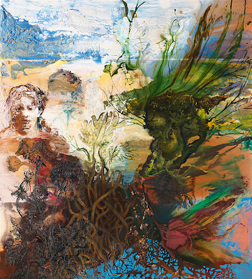
Paul Smulders
Untitled C2011.A01 Acrylic/oil paint on canvas 200 x 180 cm

“Curiosity plays an important role in my daily existence as a visual artist. Sometimes my studio looks like a laboratory and the way I work as an artist can be compared to an alchemist, studying and experimenting with new materials or to examine how all kinds of paints, lacquers, and pigments react with one another. It invites me to explore the unknown and unexpected qualities of painting materials that were designed, produced and meant for construction industry or mass consumption. These painting materials open new possibilities compared to the more traditional ones, and they play an important and decisive role in how the skin of my work look. It gives me scope and flexibility to play with new differences between the consistency of paint, transparency, tone, linear drawing, colour balance and space.”

Paul Smulders
Untitled C2011.C01 Acrylic/Oil paint/transferprint on canvas 150 x 200 cm

As the youngest of eight children by academic parents, it was expected of Paul Smulders that he would study for a classic academic degree. He moved from his hometown Breda to Amsterdam, where he began his studies at the department of History. After a year he changed to Akadamie voor Beeldende Kunsten in Amsterdam, and in 1987 when he had finished his studies, he continued in Italy at the La Nuova Accademia delle Bell’Arti di Milano where he studied one year as a post-graduate. Since then he has had numerous exhibitions all over the world.

The human being
A certain motif has dominated his paintings since his studies at the academy in the 1980s. It is the human being in all its facets. At the academy, the study of the human body could stretch over three weeks, with one drawing and one nude model. However, the drawing was not the essential outcome from this course, but it was the thorough knowledge of every muscle and bone in the human body. He knows it by heart and it becomes vivid in the latest collection.
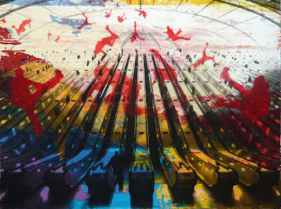
Paul Smulders
Untitled C2011.C03 Acrylic/Oil paint/transferprint on canvas 080 x 150 cm

“I have started to draw again at the paintings, and by using a syringe I can make very loose drawings. I cannot fully control the amount of paint that floats out, which means that I end up with a line that is very similar to an etching.

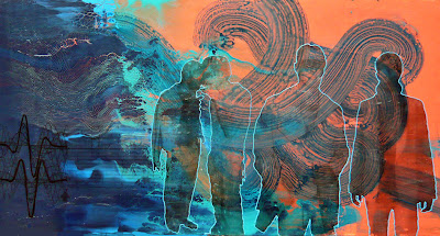
In several of his works from the 90s, there are almost scientific studies of the human body in motion at the canvas, and there are clear references to the photographer Edward Muybridge’s works, who was one of the pioneers within the field of photography and later on with the movie as well. But Paul Smulders watched the people that he met every day on the street and on the ferry on his way to the studio, and made close-ups of faces painted out of his memory. The human being is still a central motif in Smulders’ paintings, but it is more a depiction of the human being in general.

“The human figures in my work play an important, but relatively anonymous role. Some are painted in details, vague, as silhouettes or built up in pixels, but they all seem to wander around in unknown surroundings. Most of the time they do not have any direct contact with each other, but they try to cope with the seemingly new surroundings.
  I am interested in the fact that the contemporary human being is alienated more and more from his natural origin. This is not a critical note or a global disaster, but more a progress of humanity. The consequence of this development is that the distance between people becomes wider in daily life, and communication is digitalized. Apart from that, it is possible that technology will enter our bodies literally and take over physiological processes. Maybe I do not even exaggerate by suggesting that within 200 years from now a post- human period will start, in which the human physical nature will play a less significant role. Nobody knows what the consequences will be. These thoughts, however, have nothing to do with science fiction or defeatism, but are more reflection about how people deal with new developments and what might become of humanity later on.”

Between chaos and order
If the viewer is looking for guidance in the titles to interpret the artwork there is not much help to find, the titles are all Untitled followed by numbers that indicates the year and month the work was made. Nevertheless, Smulders kindly invites the viewer to an enjoyable romp activating visual and intellectual senses. The alchemist challenges all sorts of different materials at the canvas and the painting grows from the abstract formations and elements. He has a clear sense of direction, but at the same time, the process is clearly intuitive, removing and adding elements during the act of creation. It is a constant search for equilibrium between chaos and order.

Paul Smulders
Untitled C2012.A01 Acrylic/Oil paint on canvas 180 x 500 cm

Smulders has a large archive of visual materials that he uses in the paintings. Daily he finds images in newspapers, magazines or at the internet to his collection. In the first place, it is not the motif that is the most important, but it is the rhythm in the image. Paul Smulders finds a large photo of a swarm of grasshoppers and points at the space in between the small insects,

“It was this rhythm I found interesting. When I choose to use it in a painting it enables me to experiment and investigate how material and image relate and reinforce one another.”

He transfers the computerized image to the canvas using a relatively simple method. And images of urbane settings, insects, gene strings, printed circuit boards, or city maps create odd landscapes, or complex puzzles, that indicate a fascinating narrative skill, arisen from an undisguised interest in the surrounding society, which are sampled and communicated through an expressive imagery language.

Traces in time
Ornamented flowers and leaves with references dating back to the 18th century botanic drawings, wind over some of the paintings’ tactile surfaces to maintain the balance and perhaps soften up the more dramatic motifs. The references are diverse but one of the figures that reoccur is Ikaros. According to the Greek myth, Ikaros was trapped in a labyrinth. He succeeded to escape using a pair of wings made of wax that his father had fashioned for him. Despite the warnings, Ikaros flew too close to the sun, his wings melted and he fell into the sea. The figures in Smulders’ imagery world wander through labyrinthine surroundings. The Labyrinth motif occurs in numerous works, in the shape of x-rays of the brain with its tortuous shape, or printed circuit boards that draw the attention to a city map with its fine lines that branch off and form treacherous mazes. Man and science mutate to a complex organic unity.
Smulders is constantly seeking to keep the irrational and rational in equilibrium, and on his way through the labyrinth, there are still uncountable ways to explore. © RIPRODUZIONE RISERVATA

Paul Smulders
Untitled C2011.C16 Acrylic/Oil paint/transferprint on canvas 110 x 120 cm


Paul Smulders paintings are a field of tension of abstract painted parts in combination with a graphic pattern. The opposition between abstract and figurative also continues to play. His works seem to divide up into different levels which, however, do reinforce one another. Paul Smulders wants to link his subjective way of painting with objectively reported images selected from all kind of the media. www.paulsmulders.com